
Not all websites are created equal. Especially websites needing adaptive tools. Even those struggling with visual impairment may prefer a larger font size and content structure. Website accessibility can range from providing options to enlarge text to ensuring a proper color-coding system. To ensure our website is accessible to everyone we will use our website accessibility checklist to evaluate how to make different aspects of our website more accessible.
For this evaluation, we used our homepage.
Titles and Headings
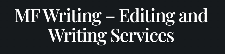
The first step on our website accessibility checklist is to evaluate the mfwriting.com homepage. We will begin with the title and headings. The homepage title is in large text. Our title reads, “MF Writing—Editing and Writing Services.” The first heading, “MF Writing Blog” is at the bottom of our website. Currently, we have several images placed above the blog. Our first step in improving our website accessibility would be to move the blog. To ensure our more critical content is accessible, our blog will relocate to the top. Additionally, to keep our headings distinctive from our title, we will align them to the left and follow a consistent format throughout all web pages.
To improve our color choices, we will remove the instances of reverse-type text (light text on a dark background). We have several instances of this type of text, making it difficult for those with color blindness or other visual impairments to read the text we are attempting to make stand out. To form better brand awareness, we will also change the background to match our logo and use darker text to ensure it is easy to read. Additionally, we will keep all text inside blocks consistent in color and font.
Images
Next on the checklist is to ensure our images have “Alternative Text” or “Alt-Text.” Alt Text briefly describes the image, table, or graphic so that screen readers can read it. Without proper alt text, it can confuse those with visual impairments about what the image contributes to the context. Screen readers may read images without alt text as their file name, which in many cases would not prove helpful to a visitor.
For mfwriting.com, we have ensured that all images, logos, or graphics have alt text. We will maintain consistency throughout our website regarding image descriptions. However, we plan to evaluate whether the images support our website.
Keyboard Access
Many struggle to use a computer mouse and, because of this, rely on keyboard access. Keyboard access means using a keyboard instead of a mouse to navigate the page. We used the “tab” button to test this and see what our keyboard would move to. Through this, we learned that our logo, all menu buttons, images with links, and our blog post are easily accessible through the hitting tab. However, this practice also helped us discover a button missing a link. To improve, we will double-check all current and new buttons we create to ensure they redirect the user appropriately.
Proper Formatting
As we continue to review our accessibility, consistency is a key phrase. We want to create a pattern that is mimicked on each page to allow easy access to the information our visitors come to learn. To optimize our accessibility, we plan to provide a search box at the top right of every page. In addition, we will use a consistent block pattern so information can be easily recognized by its placement and in order of importance.
When reviewing accessibility, the page’s structure is crucial. The World Wide Web Consortium (W3C) uses its website to educate and explain how to identify different accessibility requirements and implement them. According to their recommendation, the content should be linear. This means that the content is in different columns. The navigational tools will be either at the top or bottom, depending on how the webpage is developed. The content is separated based on the importance of the information.
Website Accessibility Checklist
We understand that many changes must happen to optimize our website to satisfy more visitors. The first of many is our page structure. We are still identifying the critical elements of our page, so before we can finalize a page structure, we must understand what information is most important. After understanding the importance of the content, we can decide on a page structure that will showcase that information best. We will continue our efforts to have alt text in all images and graphics and ensure they support the material we are using. To ensure keyboard access, we double-check all links and do our “tab test” every few months. With these guidelines in place, we assure that mfwriting.com will be easily accessible to all our viewers.